5 Essential Principles for Designing Professional Metal bag Labels
Though bag metal labels may seem unremarkable—just small metal pieces—their design actually demands careful consideration. They cannot be designed arbitrarily or with wild imagination. So what should be noted when designing these metal labels for bag? Below, OYC bag hardware manufacturer shares five key points for designing metal bag labels:
Information Hierarchy: Establishing a Reading Order Within a Small Space
The information hierarchy forms the foundation of all visual communication design. For metal tags on handbags, this principle is particularly important—as the physical dimensions of the tags are extremely limited, typically no more than 2–5 centimetres square, yet they may need to accommodate the brand name, year of foundation, country of origin and even collection details. How to ensure that information is properly organised and prioritised within this limited space is the primary challenge facing designers.
Information Hierarchy
Effective metal label design typically follows a three-tier information structure:
First layer: Brand identity (key message)
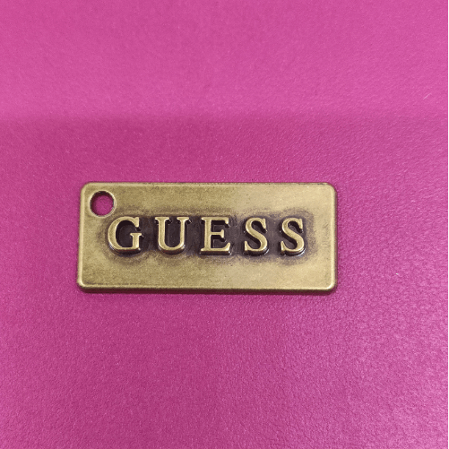
This is the most eye-catching element on the label and the first to be noticed; it is usually the brand name or a distinctive symbol. In terms of size, it should occupy 40–60 per cent of the label’s surface area; in terms of positioning, it should be situated at the visual centre or the golden ratio point; in terms of finish, it is often embossed or highly polished to distinguish it from the background text.
Second layer: Brand attributes (supplementary information)
These include the year of foundation, the brand’s place of origin, and collection names. The font size for this type of information is typically one-third to one-half that of the main information; it is positioned below or to the side of the main information, and through the use of reduced size, positioning or design techniques, creates a sense of visual receding.
Third layer: Supplementary information (secondary information)
This includes details such as material specifications, size markings and product codes. On metal labels, this information is usually kept to a minimum—sometimes omitted entirely, with the details carried instead by woven labels or paper hangtags. If it must appear, it is often printed in very small type and concealed at the edge or on the reverse side of the label.
Design Techniques for Creating Hierarchy
When establishing information hierarchy on metal surfaces, designers have several specialised tools at their disposal:
Variation in size is the most direct method
On a 2.5 cm × 4 cm label, the font size for the main information can be as large as 8–10 pt, whilst supplementary information is often reduced to 4–6 pt. This striking contrast ensures that even at a glance, the viewer can accurately identify the brand name
The layout of elements defines the reading path
Metal labels for Western brands typically follow a left-to-right, top-to-bottom reading pattern. The main information is placed in the upper-central area, with supplementary information arranged horizontally below; if a vertical composition is adopted, one may draw inspiration from the ‘colophon-style’ layout found in calligraphic works—where the main text is centred on the right and supplementary information is placed on the left, creating a subtle sense of hierarchy.
Differences in craftsmanship create visual weight.
A raised logo exerts a visual ‘pull’ towards the viewer, whilst recessed text appears more understated and modest. A highly polished surface reflects light intensely, drawing attention; a sandblasted or brushed background, by contrast, recedes into the background. The combination of different finishes can create an almost three-dimensional ‘visual topography’ on a two-dimensional surface, guiding the eye to linger in sequence.
Information Minimalism: Less is More
In metal label design, ‘less is more’ is not merely an aesthetic principle, but a practical reality of the manufacturing process. The production of metal labels involves processes such as mould-making, die-casting and electroplating; every additional design element increases the complexity of the mould and reduces the yield rate. More importantly, an excess of information makes the label appear cluttered and chaotic, thereby undermining the brand’s communicative impact.
A useful industry convention is to feature only the brand name and (optionally) the year of foundation on the metal label, relocating all other information to the packaging or a hangtag. As one industry insider put it: ‘A metal label is a brand’s signature, not its CV.’
Typography: The Poetry and Logic of Space
If the hierarchy of information determines ‘what is said’, then typography determines ‘how it is said’. Typography is the art of arranging text within space—character spacing, line spacing, alignment and white space. These seemingly minor parameters collectively determine the visual character of a label and the reading experience.
The Logic of Letter Spacing and Line Spacing in Metal Labelling
In the design of metal labels, the adjustment of letter spacing and line spacing requires a far greater degree of precision than in graphic design. This is due to the ‘shrinkage effect’ of metal—the same font size often appears smaller on die-cast metal parts than on printed matter, as the reflection on the metal surface ‘swallows up’ some of the stroke edges.
Character spacing
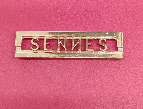
Better to be generous than cramped. The classic use of copperplate-style typefaces on labels often involves maintaining relatively generous character spacing. This is not a luxury, but a functional necessity—generous spacing ensures that the outline of each letter is clearly distinguishable and prevents strokes from merging. When a typeface adopts an engraving style, its traditional proportions and generous letter spacing are integral to its aesthetic appeal; arbitrary compression would undermine its elegant character.
Line spacing
Ensure the text has ‘breathing space’. When a label needs to display two or three lines of text, the setting of line spacing is particularly crucial. Excessively narrow line spacing causes text to pile up, blurring the distinction between primary and secondary information; appropriate line spacing (typically 1.2–1.5 times the font size) ensures that each line of text has its own distinct ‘space’. In metalworking, line spacing must also take into account the physical limitations of die engraving—lines that are too densely packed may impede the smooth flow of metal during die-casting.
The Rhetoric of Alignment
In typography, alignment is not merely a technical choice, but also a rhetorical strategy:
Centre alignment is the most common choice, conveying a sense of stability, classicism and authority. It is suitable for labels featuring a single brand name and is the preferred alignment for luxury brands.
Left alignment conveys a sense of modernity, rationality and practicality. It is commonly found in label designs with numerous information elements that require a clear reading order.
Right-alignment is relatively rare on metal labels, though it occasionally appears in designs that deliberately emphasise ‘asymmetrical aesthetics’ or ‘Oriental charm’.
It is worth noting that ‘visual correction’ of alignment on metal labels is more complex than in digital typesetting. This is because the edges of characters on die-cast metal components feature minute rounded corners, meaning the visual centre line may deviate from the geometric centre line; designers must therefore make minute adjustments based on their experience.
White Space: The ‘Breath’ of Labels
In graphic design, white space is regarded as the ‘breath’ of a design. This concept applies equally to metal labels—and is all the more valuable there.
The margins between the label’s edges and the text constitute the first layer of white space. Margins that are too narrow make the label appear cramped and crowded; margins that are too wide make the information seem feeble and insignificant. The classic proportion is for the edge white space to be 15–20 per cent of the label’s shorter side. The negative space (counter space) between letters constitutes the second layer of white space. Master typographers typically reserve ample internal white space within characters such as ‘O’, ‘C’ and ‘e’, ensuring that these characters remain legible even if the lines ‘expand’ slightly following metal die-casting.
Leaving blank spaces between layers of information creates visual ‘pauses’ and ‘breathing space’, giving the viewer a sense of rhythm whilst browsing the content. This is akin to a rest in music—it is in the silence that meaning becomes clearer.
Typefaces: Shaping Character on Metal
Typefaces are a core element of a brand’s visual identity system. On metal labels, the choice of typeface is not only a matter of aesthetics, but also of technical feasibility and the final visual outcome. A typeface that appears elegant and delicate on a screen may be rendered unrecognisable after metal die-casting.
Font Families for Metal Labels
Combining industry practice with typographic theory, fonts suitable for metal labels can broadly be categorised into the following families:
Engraving-style fonts
This category represents the ‘classical school’ of metal label design. Its origins can be traced back to the 18th-century art of copperplate engraving—where craftsmen used engraving tools to carve text into copper plates, resulting in strokes with distinctive variations in thickness and sharp, defined terminals. Representative examples include Copperplate Gothic, Engravers and Shelley Script. The core characteristics of this typeface category are: stroke ends featuring fine serifs (or serif-like accentuations); a predominance of uppercase letters, with lowercase letters often replaced by ‘small caps’; and an overall aesthetic that is classical, refined and exudes a sense of sophistication. The design of Copperplate Gothic originally stemmed from the practical requirements of copperplate engraving — to ensure the terminations of the engraved lines were clearly distinguishable, the designer deliberately added serif-like accentuated engravings to the ends of the strokes.
Sans-serif fonts
Sans-serif fonts are the preferred choice for brands seeking a modern, minimalist style. Representative examples include Helvetica, Futura and Gotham. Their advantages on metal labels lie in their uniform strokes, which minimise the risk of uneven thickness—the so-called ‘flow effect’—after die-casting; their strong geometric character, which naturally complements the industrial feel of metal; and their ability to remain legible even at small sizes. With the rise of minimalism in recent years, the use of sans-serif fonts on metal labels has become increasingly widespread, as brands tend to ‘let the quality of the material and the craftsmanship speak for themselves’.
Serif fonts
With their traditional, authoritative and elegant character, serif fonts are commonly found in long-established luxury brands. Notable examples include Didot and Bodoni. Their delicate serifs present a challenge in metal die-casting—lines that are too fine may be ‘filled in’ during the die-casting or electroplating process. Consequently, when selecting serif fonts, designers must liaise closely with production engineers to ensure that the serif thickness does not fall below the manufacturing limits.
Script fonts
Script fonts with a handwritten feel are well-suited to emphasising a brand’s ‘artisan’ or ‘handcrafted’ qualities. Classic choices include Palace Script and Bickham Script. The use of such fonts on metal labels draws closely on the tradition of copperplate engraving—18th-century copperplate script was originally designed for the engraving process, and the fluidity of its strokes derives from the trajectory of the engraving tool. When using script fonts, particular care must be taken: do not arbitrarily increase or decrease the letter spacing, as this may disrupt the fluidity of the strokes; avoid setting words entirely in capital letters, as this may render them illegible.
The ‘suitability for metal’ of typefaces
Not all excellent typefaces are suitable for metalwork. When selecting a typeface, designers must also assess the following technical aspects:
Uniformity of stroke thickness
In die-casting, the flow of molten metal within the mould is influenced by gravity—vertical strokes may exhibit slight variations in thickness due to differences in the metal’s flow velocity. Fonts with strokes that are excessively slender or vary drastically in thickness are prone to localised under-filling or flash. Whilst zinc alloy die-casting is well-suited to producing complex 3D shapes and intricate designs, it still imposes certain requirements on the proportions of font strokes.
Feasibility of serifs
Extremely fine serifs (hairline serifs) are difficult to maintain intact during die engraving and may be obscured by the plating layer during electroplating. If the brand insists on using such typefaces, it is recommended to use subtractive processes such as laser engraving as an alternative to die-casting. Stainless steel is suitable for achieving precise graphics through etching or laser processes, and offers superior rendering of extremely fine lines compared to casting.
Choice of font weight
For metal labels, it is generally recommended to select font weights ranging from Regular to Bold. Light weights are too delicate and carry high manufacturing risks; Black or Heavy weights, on the other hand, may appear bulky in die-casting, with the ‘counter space’ within the letters filled in, resulting in reduced legibility.
Matching Typefaces to Brand Identity
The ultimate criterion for typeface selection is brand positioning. The typeface used on a label should be an extension of the brand’s visual language:
Classic luxury brands
Tend to favour engraved or serif typefaces to convey a sense of historical depth and artisanal heritage. Labels are typically gold or silver-plated, which complements the classical character of the typeface.
Modern, minimalist brands
These favour sans-serif typefaces to emphasise clarity, restraint and a contemporary feel. Materials such as stainless steel or matt plating may be used, creating a harmonious balance with the typeface’s geometric rationality.
Avant-garde designer brands
These may break with convention by using bespoke typefaces or deconstructed typography, treating the label itself as a design statement. Such brands are often willing to bear higher moulding costs for unique typefaces.
Graphics and Colour: The Alchemy of Visual Composition
If typeface is the ‘language’ of labels, then graphics and colour are their ‘expressions’. The graphic elements and colour schemes on metal labels require striking the perfect balance between aesthetic aspirations and technical feasibility.
Three Types of Graphic Elements
Graphic elements on metal labels typically fulfil one of the following three roles:
Brand Mark
This is the most central element of the graphic design and may take the form of a brand logo (such as a letter combination, graphic emblem or abstract symbol) or a supplementary decorative motif. Brand marks are usually rendered in die-casting as raised (relief) or recessed (intaglio) features, creating a contrast of light and shadow through differences in height. A well-designed brand mark on metal should be ‘recognisable from a distance and appreciable up close’—with clear contours when viewed from afar and rich in detail when examined closely.
Ornamental borders and patterns (Ornamentation)
Borders and decorative patterns act as the ‘frame’ of a label, serving to define the visual scope and add a sense of refinement. A classic approach to incorporating an engraved copperplate style on labels is to ensure that the thickest lines in the illustrations and decorative motifs are of a similar thickness to the vertical strokes of the typeface, whilst the thinnest lines should also be consistent. This consistency in line thickness creates a sense of visual unity.
Functional Graphics
These include hole markings for securing labels and anti-counterfeiting microtext. The design of such graphics must meet functional requirements whilst blending as seamlessly as possible into the overall aesthetic, avoiding any jarring elements.
The Colours of Metal: Beyond ‘Gold’ and ‘Silver’
The world of colours in metal labels is far richer than just ‘gold’ and ‘silver’. Through surface treatment processes such as electroplating, spray painting and oxidation, metal labels can offer an almost infinite range of colour possibilities.
Colour range of electroplating
Electroplating is the most common method of colouring metal labels; it involves depositing a thin layer of metal or alloy onto the surface of the base metal to impart a specific colour and provide a protective coating. Common electroplated colours include
Gold Series: Bright Gold, Matt Gold, Rose Gold, Antique Gold
Silver Series: Bright Silver, Matt Silver, Gunmetal, Antique Silver
Dark Series: Black Chrome, Black Nickel, Gunmetal, Dark Grey
Vintage Series: Antique Copper, Bronze, Distressed Gold
Considerations regarding the electroplating process
The thickness of the electroplated layer directly affects the colour saturation and durability. A coating that is too thin is prone to wear and fading; conversely, a coating that is too thick may obscure the fine texture of the die-cast component. High-end brands typically require electroplating processes to meet specific thickness standards and undergo salt spray testing to ensure corrosion resistance. The electroplating process also provides an additional protective layer for labels, helping to prevent them from losing their lustre or corroding over time.
Spray Painting and Colour Filling
For labels requiring specific brand colours (such as a brand’s signature red or blue), spray painting or colour filling offers greater flexibility. Enamel, paint or epoxy coatings can be applied to the recesses of die-cast components to create a colour contrast. For example, a raised logo retains its natural metallic colour, whilst the recessed background is filled with the brand colour—this ‘two-tone effect’ is both eye-catching and refined on the label.
The Synergy of Graphic and Colour Design
Graphics and colour must be considered in tandem in design, rather than in isolation:
The principle of legibility through value contrast
Regardless of the colour combination used, there must be sufficient value contrast between the brand name and the background. A gold logo on a gold background (though technically feasible, it is visually ineffective) is one of the most common design errors. Designers need to visualise how the label will appear under three lighting conditions: showroom lighting (ideal conditions), natural diffused light (common conditions), and backlighting or low light (extreme conditions).
Harmony between colour and material
The colour of metal labels should be consistent with the handbag’s hardware (zips, buckles, rivets, etc.). A rose gold logo paired with a silver zip would appear visually cluttered; an antique bronze label paired with bright gold fastenings, on the other hand, might create a sense of incongruity due to a mismatch in eras. Treating the label as an integral part of the handbag’s hardware system when planning its colour scheme is an essential aspect of the brand’s overall design.
The Design Value of Antique Finishes
An antique finish is a surface treatment designed to deliberately evoke a ‘sense of time’. Through chemical processing, the colour of recessed areas is deepened whilst raised areas retain their lustre, creating a texture reminiscent of well-worn copperware. For brands that emphasise ‘heritage’ and ‘history’, this treatment can create the impression that a new product has ‘existed for many years’, endowing the product with emotional value that transcends the physical object itself.
Recommended Design Process
Based on the synergy of the five principles, the recommended design process is as follows:
Phase One: Brand Definition
Clarify the communication objectives of the label—what character does the brand need to convey? Where will the label be positioned (as a visual focal point on the front, or as a discreet internal identifier)? This phase determines the framework for the information hierarchy.
Stage Two: Conceptual Sketching
Explore various combinations of typefaces and graphics on paper or digitally, without considering technical details, and focus on the possibilities for visual expression. During this stage, reference may be drawn from classic styles such as engraved typefaces.
Stage Three: Technical Assessment and Optimisation
Discuss the conceptual proposals with technical suppliers to clarify technical constraints and cost budgets. This stage may require compromises and adjustments—for example, replacing an extremely thin serif typeface with a more robust alternative, or adjusting the relief height to accommodate the electroplating process.
Stage Four: Prototype Validation
Physical prototypes are produced to evaluate the design’s effect under natural light and through tactile experience. This step is crucial—as there is often a significant difference between what is seen on screen and how the metal appears in reality.
Conclusion
The five key design principles for metal labels on handbags—information hierarchy, typography, typefaces, graphics and colour—together form a comprehensive design methodology that spans from content to form, and from concept to physical realisation. These principles concern not only aesthetic judgements, but also a profound understanding of technical feasibility, a precise grasp of brand messaging, and meticulous attention to the user experience.
An excellent metal label is the intersection of reason and emotion. Reason lies in the need for clearly defined information hierarchy, logically coherent typography, typography that is technically feasible, and harmonious graphics and colours. Emotion lies in the label’s ability to stir the viewer’s feelings within such a compact space—the trust born of exquisite craftsmanship, the delight arising from the beauty of detail, and the sense of identification stemming from a resonance with the brand’s ethos.
From the artisanal heritage of 20th-century copper plate engraving to today’s technological innovations in zinc alloy die-casting and multi-colour electroplating, the design language of metal labels has continually evolved, yet its core pursuit has remained unchanged: to achieve the most precise expression within the smallest of spaces. For designers, mastering these five principles is the key to elevating metal labels from mere ‘identifiers’ to true ‘works of art’.